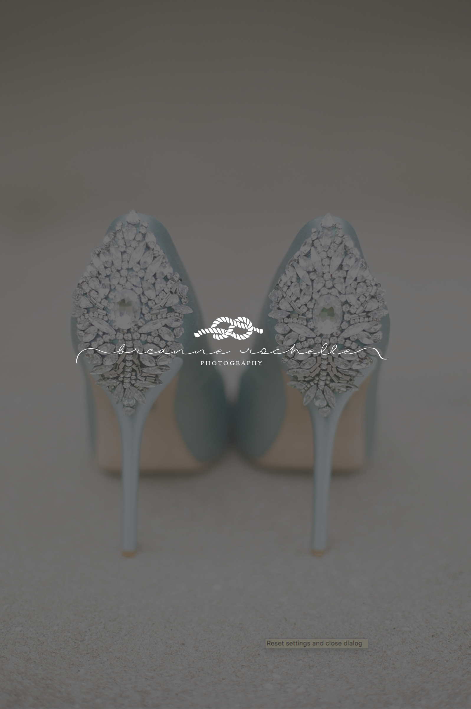
Logo Design – Breanne Rochelle Photography
I was SO excited to get to work with Breanne, a Michigan-based wedding photographer, on her nautical inspired branding and custom logo design! With a love for the sea, and an even greater love for marriage and love itself, we decided a sailor’s knot graphic was the perfect touch for Breanne’s logo. I really love the soft colors, especially the blue as it’s a great nod to the sea and reminds me of a soft fog over the water in the morning. It has such a romantic feel to it! She wants to appeal to a higher end bride, as well as retain her feminine style, so using a classic font paired with a girly scripted one works really well. For her watermarks and variations, a classic stamp and initial-style mark complete the look!

Breanne is incredibly talented, and sweet to boot, so check out her new branding and give her a shout if you’re in the Michigan area! XO
Breanne’s work can be seen here: www.breannerochellephotography.com
**Featured Image by Breanne Rochelle Photography**